Website Style Directions
Three distinct visual approaches for the new Cowley Companies website. Each direction includes typography, color application, button styling, and reference examples.
Our Goal: Please review each direction and select one (A, B, or C) to advance with. We'll use your chosen direction as the foundation for the full site design.
Existing Cowley Brand Colors
Modern Legacy
Established and confident with subtle heritage cues. Feels like a premium real estate investment office with refined, editorial polish.
Typography
Phoenix, Arizona
Six Decades of
Building Value
A Family Real Estate Investment Office
Founded over six decades ago by Dixon "Duke" Cowley, Cowley Companies is a family real estate investment office based in Phoenix, Arizona. Our diverse portfolio spans residential, commercial, mixed-use, industrial, and adaptive reuse projects across the Southwest. With a focus on adding value and enhancing communities, we leverage an entrepreneurial spirit to identify opportunities rooted in understanding local markets and the needs of each community.
Button Styles
Sharp corners • Orange accent • High contrast
Color Palette
Warm neutrals • Single restrained accent
Font Specifications
Headings: Playfair Display (500–700 weight)
Body: Inter (400/500 weight)
Animation & Motion
Subtle and restrained. Gentle fade-ins on scroll, smooth hover transitions. No dramatic effects—movement should feel confident and unhurried, like turning pages in a premium magazine.
Layout Approach
Editorial grid with generous whitespace. Strong horizontal rules as section dividers. Content breathes. Asymmetric compositions where photography meets text create visual interest.
Imagery Style
Architectural photography with strong cropping. Documentary-style, not overly staged. Muted saturation. Phoenix cues handled subtly through light quality and sky tones rather than obvious desert motifs.
Overall Feel
Like walking into a well-appointed private office. Quiet confidence. Nothing flashy, but everything is considered. Trust is built through restraint and quality, not through selling.
Best for Cowley if...
You want to lead with legacy, longevity, and credibility. This direction appeals to institutional investors and partners who value stability and track record over regional personality.
Notes from Taylor
The Playfair Display serif gives this direction real editorial gravitas—it reads as established without feeling dated. The sharp-cornered buttons signal decisiveness. What I like here: the warm off-white background prevents the "premium" feeling from tipping into cold/sterile. It walks a nice line between heritage and modernity.
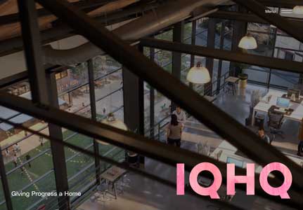
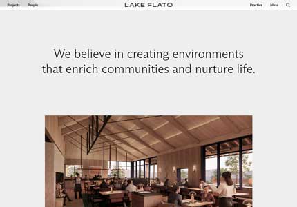
Reference Site
This site represents the mood and quality level. The Cowley Companies site will be styled according to the specifications within this direction.
Southwest Contemporary
Warm, regional, and modern. Feels Phoenix-native and human, without drifting into "rustic" or overly trendy.
Typography
Phoenix, Arizona
Six Decades of
Building Value
A Family Real Estate Investment Office
Founded over six decades ago by Dixon "Duke" Cowley, Cowley Companies is a family real estate investment office based in Phoenix, Arizona. Our diverse portfolio spans residential, commercial, mixed-use, industrial, and adaptive reuse projects across the Southwest. With a focus on adding value and enhancing communities, we leverage an entrepreneurial spirit to identify opportunities rooted in understanding local markets and the needs of each community.
Button Styles
Rounded corners (6px) • Warm accents • Subtle lift on hover
Color Palette
Sand/stone base • Orange primary • Terracotta secondary
Font Specifications
Headings: Fraunces (500–600 weight)
Body: DM Sans (400/500 weight)
Animation & Motion
Warm and welcoming. Gentle parallax on images, soft fade-and-rise animations on scroll. Buttons lift slightly on hover. Movement feels organic and natural—like a desert breeze, not a machine.
Layout Approach
Flowing sections with soft background color bands. Content areas feel like rooms in a well-designed home. Some asymmetry, but always balanced. Generous but not excessive whitespace.
Imagery Style
Natural light, golden hour warmth. Desert-modern architecture. Material textures: stone, wood, concrete, copper. Sonoran landscape and mountain backdrops. People when appropriate to show community connection.
Overall Feel
Like meeting a trusted local expert at a beautiful desert property. Professional but approachable. You feel the Phoenix sun and sense of place. Warm handshake energy.
Best for Cowley if...
You want the site to feel inviting and place-based while still reading as serious. This appeals to those who value community connection and regional expertise—investors who want a partner who truly knows Phoenix.
Notes from Taylor
This direction has the most personality of the three - Fraunces has an organic quality that feels warm without being casual. The terracotta accent is a smart way to bring in regional flavor without cliché. Rounded buttons + subtle hover lift = approachability.
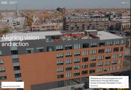
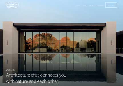
Reference Sites
These sites represent the mood and quality level. The Cowley Companies site will be styled according to the specifications within this direction.
Institutional Minimal
Clean, restrained, and corporate in the best way. Prioritizes structure, readability, and investor-grade credibility.
Typography
Phoenix, Arizona
Six Decades of
Building Value
A Family Real Estate Investment Office
Founded over six decades ago by Dixon "Duke" Cowley, Cowley Companies is a family real estate investment office based in Phoenix, Arizona. Our diverse portfolio spans residential, commercial, mixed-use, industrial, and adaptive reuse projects across the Southwest. With a focus on adding value and enhancing communities, we leverage an entrepreneurial spirit to identify opportunities rooted in understanding local markets and the needs of each community.
Button Styles
Near-sharp corners (2px) • Blue primary • Clean transitions
Color Palette
Near-monochrome base • Blue primary • Orange highlights
Font Specifications
Headings: Inter (600–700 weight)
Body: Inter (400 weight) — Single font system
Animation & Motion
Minimal and precise. Quick, efficient transitions. No unnecessary flourishes. Hover states are instant feedback, not decoration. If something moves, it's because it communicates information.
Layout Approach
Strong grid system with clear content hierarchy. Defined sections, easy to scan. Data-friendly—tables and charts feel at home. Maximum clarity, minimum friction. Fast to navigate.
Imagery Style
Fewer images, used strategically. Crisp, documentary-style photography. Black and white acceptable. Architectural details over full buildings. Data visualizations where appropriate.
Overall Feel
Like reviewing materials from a top-tier fund manager. Zero fluff. Everything earns its place. Serious, stable, operationally tight. You trust them because they don't need to impress you.
Best for Cowley if...
You want to read as the most professional and "investment-grade" option. This appeals to institutional partners, sophisticated investors, and those who value efficiency over personality. Zero visual fluff.
Notes from Taylor
The single font system (Inter throughout) creates maximum clarity and operational efficiency—no typographic flourishes, just information. Using the existing brand blue as the primary button color gives this direction instant gravitas. The near-sharp corners (2px radius) are a nice middle ground: not harsh, but still decisive. This is the direction that would scale best if Cowley ever needed investor decks, data dashboards, or annual reports to feel native to the site. Least personality, but also the least risk of feeling dated in 5 years.
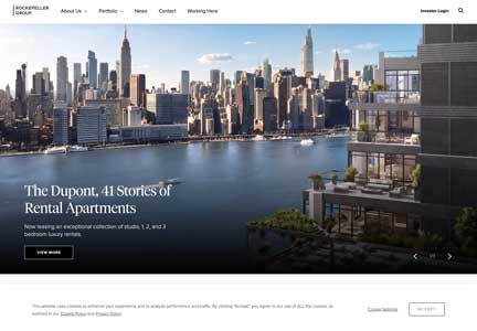
Reference Sites
These sites represent the mood and quality level. The Cowley Companies site will be styled according to the specifications within this direction.